At Govt.nz, we’re working on producing information about services that are relevant to older people. We published a big chunk of new content about health services on the site on the 29th of April. Our approach is to organise content around the needs of users rather than the structure of government. Here’s the process we followed to decide how to group the pages so that people can find the information they need.
1. Environment scan — what information is out there?
To begin, we looked online and found all the information and resources we could relevant to older people. We also got help from the Future Service Delivery to Older New Zealanders inter-agency working group to identify what services are available to seniors.
Detailed description of Image 2
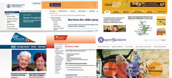
The image is a collage of website homepage screenshots, including:
- Ministry of Social Development
- Ministry of Health
- Super Gold
- Age Concern
- Super Seniors.
2. Talking to people — what do people want to know?
We talked to older people about their experiences with government and the services they use. We talked to non-government organisations about their work supporting older people, and contact centre staff to find out what people know and don’t know when calling, and what they call about.
Find out more about this discovery phase research.
3. Open card sort — how do people group the topics?
Once we knew what topics we needed to cover we ran an open card sort using OptimalSort. People grouped the topics together however they thought they belonged and then named the groups. While no two people put the topics in the same groups, there were reoccurring themes of help at home, accidents, wellbeing and mobility/transport. For example, the topic ‘Getting your house modified’ was put into groups called ‘Help in your home’, ‘unable to look after yourself but not significantly disabled’, ‘I want to stay in my own home’, ‘Help options’ and nine more variations.
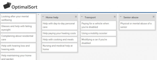
Participants move cards from a list of topics into groups that make sense to them.
Detailed description of Image 2
A screenshot of OptimalSort. Participants have grouped a series of cards under category headings.
One list that doesn’t show the category includes:
- Looking after your mental wellbeing
- Glasses and help with failing eyesight
- Complaining about residential care
- Help with hearling loss and hearing aids
- Help maintaining your home and garden
Cards sorted into the ‘Home help’ category include:
- Help with day-to-day personal care
- Help paying your heating closts
- Help with cooking and meals
- Nursing and medical help at home.
Cards sorted under the ‘Transport’ category include:
- Paying for a vehicle when you’re disabled
- Using a mobility scooter
- Modifying a car if you’re disabled.
Cards sorted under the ‘Senior abuse’ category include:
- Physical or mental abuse of a senior.
We did the card sort with a small number of participants, 19, because we knew the software would be tricky for some older users, and because we were looking for themes, not definite answers. We recruited by sending the test to our own networks of people over 65, and to the Wellington SeniorNet.
4. Making leaps — how do we join it together?
People grouped the cards quite differently, so we looked at the results and made some hypotheses.

Detailed description of Image 3
The matrix shows which topics were grouped together the most often in the card sort.
Numbers represent what percentage of times topics were grouped with each other.
Each number is a shade of blue from very light to very dark.
Very light indicates a weak relationship. Dark blue indicates a strong relationship.
- Above 60% is considered a strong relationship
- Above 30% is considered a moderate relationship.
- Below 30% a considered a weak relationship.
The strongest relationship is between ‘Help with cooking a meals’ and ‘Help maintaining your home and garden’, at 94%.
There were many relationships which scored 0, very weak. For example:
- ‘Help with cooking and meals’ and ‘Physical or mental abuse of a senior’
- ‘Help with travel to medical appointments’ and ‘Getting a needs assessment’.
In the following example, we see how closely ‘Help with cooking and meals’ is related to the other topics in the matrix.
Strong relationship to:
- ‘Help maintaining your home and garden’
- ‘Getting your house modified’
- ‘Help paying your heating costs’
- ‘Help with day-to-day personal care’
- ‘Nursing and medical help at home’.
Moderate relationship to:
- ‘Getting a medical alarm’
- ‘Getting a needs assessment’.
Weak relationship to:
- ‘Glasses and help with failing eyesight’
- ‘Help with hearing loss and hearing aids’
- ‘Help to recover from an injury’
- ‘Help if you have an injury’
- ‘Getting palliative care’
- ‘Looking after your mental wellbeing’
- ‘Maintaining social contact’
- ‘Disability allowance — what to ask your GP’
- ‘Paying for a vehicle when you're disabled’
- ‘Modifying a car if you're disabled’
- ‘Using a mobility scooter’
- ‘Transport to visit a partner in care’
- ‘Help with travel to medical appointments’
- ‘Complaining about residential care’
- ‘Physical or mental abuse of a senior’.
We designed two different versions of a site tree to test our thoughts. In one version, we split the topics into six groups and in the other, nine groups. This tested the trade-off between the difficulty of more options to choose from and the benefit of more explicit titles. For example, the first version had a group called ‘Medical help’, which was split into ‘Eyes, ears and teeth’ and ‘Accidents and injuries’ in the second version. We also tested alternative label names like ‘Keeping independent’ versus ‘Help in your home’.
5. Tree test — are topics where people expect them to be?
We ran the two tests on tree testing software, TreeJack. People clicked through a site tree (the topics and sub-topics that contain pages) and selected where they thought they would find the answers to our questions We had 44 participants for one test and 45 for the other.
Version one of the tree test results in more detail
Version two of the tree test results in more detail
If you'd like to request a text version of these results, please email govtnz@dia.govt.nz

Detailed description of Image 4
A screenshot of the TreeJack program. The page is titled ‘Task 1 of 9’. The scenario is described as ‘You’ve had a fall and are now using a wheelchair. Where would you find help to get a ramp to your front door installed?’
Respondents have selected Health, then Help in your home, then Modifying your home. Next to Modifying your home there is a button that says
‘I’d find it here’.
6. Compare and revise – what’s not working?
The variation with more groups was the winner, with a success rate of 72% compared with 65% for the other. We found out which wordings performed best and where further adjustments were needed.
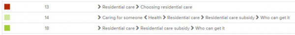
We asked participants: Where would you find out if you are eligible for help with the costs of being in a nursing home? This image shows three of the paths users took, the first incorrect, the second found the answer after backtracking, and the third found it on the first go.
Participant 13 selected ‘Residential care’, then ‘Choosing residential care’.
Participant 14 selected ‘Caring for someone’, then returned to ‘Health’, then ‘Residential care’, then ‘Residential care subsidy’, then ‘Who can get it’.
Participant 18 selected ‘Residential care’, then ‘Residential care subsidy’, then ‘Who can get it’.
7. Usability testing — can people find things in situ?
We visited the Kapiti SeniorNet to test the content once it had been published. We talked to people about what experiences they'd had with health services, and then asked them to look at a part of our information that was relevant to them. What gets published is almost never exactly what was planned months beforehand, so this was a good way to do a final check and prioritise some tweaks we'll need to make. It also gave us a chance to see people using the information in a more natural way, and look at whether people can understand the information, as well as find it.
This is clearer than anything I’ve ever seen before [in government].
This is the first of a few posts we'll do about our work around older people, so keep an eye out for more.
What techniques have you used to develop your information architecture? Let us know in the comments, we’re always keen to share experiences.
